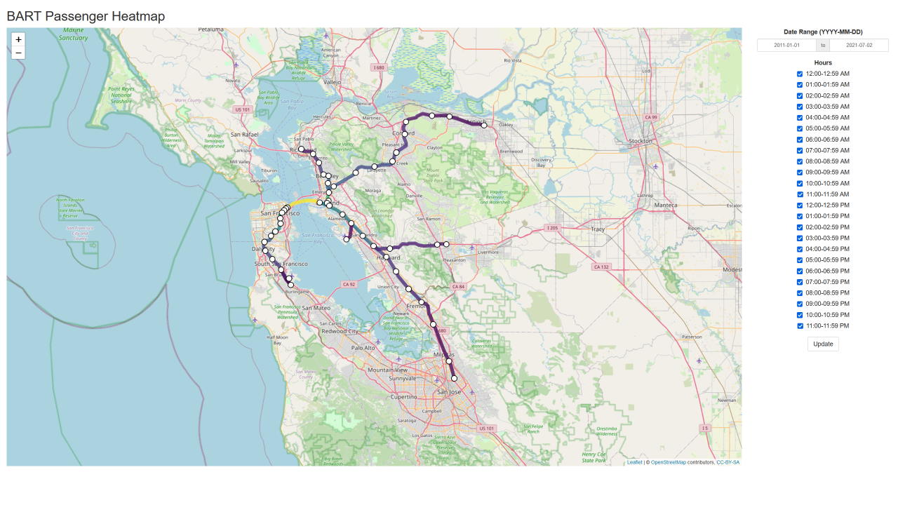
BART Passenger Heatmap
You can run this project in RStudio with the following lines:
library(shiny)
shiny::runGitHub("bart-passenger-heatmap", "jlperona")
Background
During the course of my Master’s degree, I took ECI 254 (Exploring Data from Built Environment Using R) with Professor Deb Niemeier. My choice for the final project for that class was to create a heatmap of passengers that traveled through the San Francisco Bay Area Rapid Transit (BART) system. As the class required the use of R, I decided to use Shiny to help me build the heatmap.
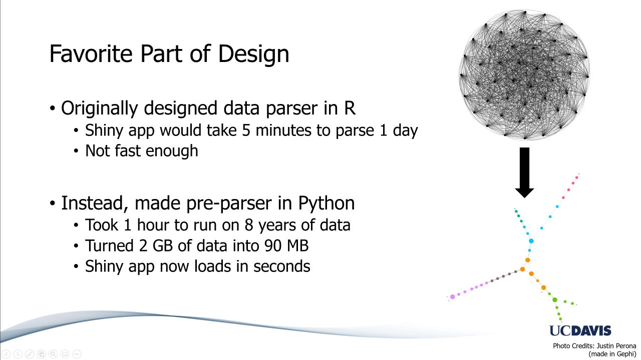
The heatmap is heavily based on one of my previous projects, jlperona/bart-hourly-dataset-parser. I wrote that parser for MAE 253 (Network Theory and Applications) with Professor Raissa D’Souza. Its purpose is to parse BART hourly origin-destination data into network files that can be imported into another program.
Project
I wanted to see the BART network mapped with actual GIS data, and with the passenger data that BART provides on their website. One of the ways of doing that was by combining Shiny, which helps me create a web application, with leaflet, which lets me map the GIS data.
Methodology
To do so, I wrote a preparser to first parse all the data into files that could be quickly parsed by the application. After I had the files, I wrote the code to parse the data in plain R, then the code to render the data as a heatmap using Shiny and leaflet. For more details on the technical aspects of the project, see this RMarkdown document in the repository.
Source Code and Installation
All code is open-source and available on GitHub at jlperona/bart-passenger-heatmap. Both it and its predecessor are licensed under the MIT License.
You can run this project in RStudio with the following lines:
library(shiny)
shiny::runGitHub("bart-passenger-heatmap", "jlperona")
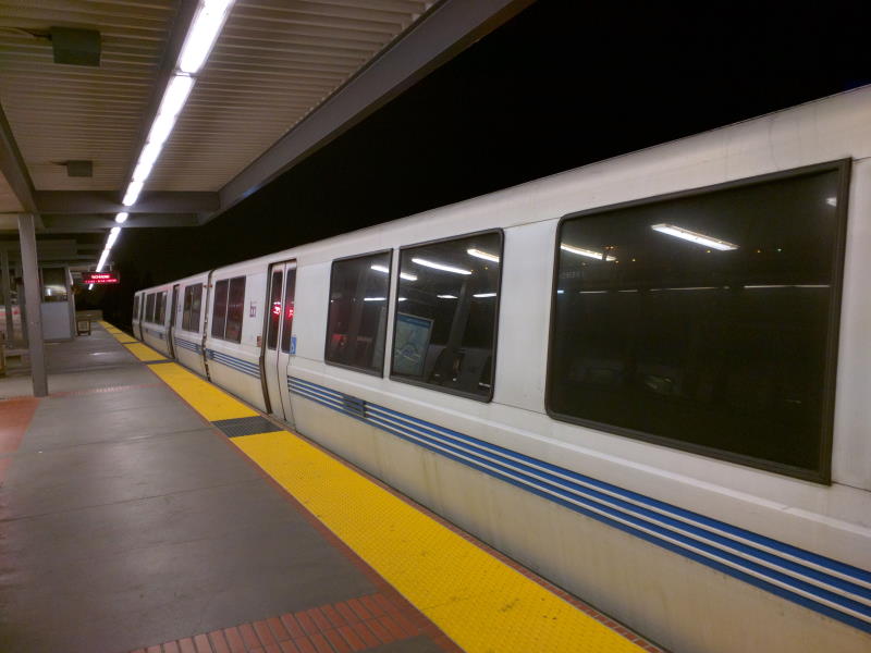
Gallery
Gallery of relevant photos to this project.